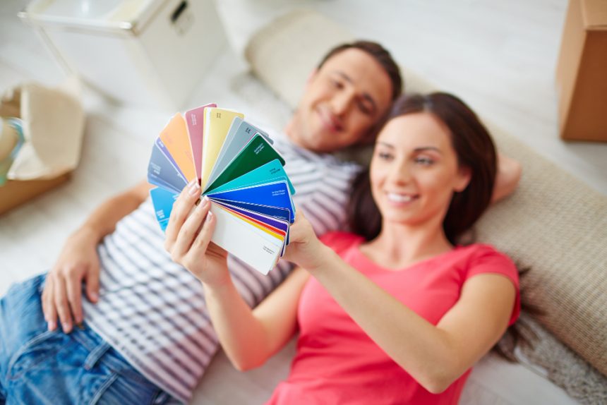
Color is far more than a visual backdrop to our lives—it is a silent yet powerful psychological influencer that continuously shapes how we feel, think, and behave. From the calming presence of a pale blue wall to the invigorating flash of a bold red, colors interact directly with our minds in ways that can alter mood, shift emotional states, and even modulate cognitive performance. Psychologists, neuroscientists, and designers alike have long studied how different colors affect the human experience, noting that subtle variations in hue, brightness, and saturation can spark measurable differences in mood regulation, mental clarity, and focus.
- Warm Colors: Stimulating Energy and Emotional Intensity
- Cool Colors: Promoting Calm, Focus, and Mental Clarity
- Neutral Shades: The Understated Backdrop
- Shades, Saturation, and Contextual Nuance
- Applying Color Psychology to Everyday Life and Work
- Harnessing Color as a Tool for Mental and Emotional Balance
At its core, the psychology of color rests on the premise that visual perception is not merely about processing wavelengths of light, but about how the mind interprets and responds to those wavelengths at an emotional and cognitive level. Research suggests that color perception feeds into deep evolutionary associations: for instance, the color red can stimulate heightened awareness and quick decision‑making—possibly linked to early humans’ need to detect ripe fruit or signs of danger—whereas green and blue often trigger feelings of tranquility, echoing the calming reliability of nature and water. These evolutionary imprints remain with us today, shaping everything from how we decorate our homes to how we design workspaces, classrooms, and digital interfaces.
Understanding this interplay enables us to harness color thoughtfully in daily life. Whether creating an environment that encourages language learning, enhancing concentration at work, or fostering a sense of calm in stressful situations, the deliberate use of color can serve as a subtle yet powerful tool for shaping mental experiences.
Warm Colors: Stimulating Energy and Emotional Intensity
Colors in the warm spectrum—reds, oranges, and yellows—are often associated with energy, movement, and stimulation. They tend to accelerate heart rate and heighten emotional awareness.
- Red: This color is strongly tied to excitement, passion, and urgency. In academic and professional settings, studies show red can sharpen detail‑oriented thinking, but it can also increase stress levels if overused. It is best employed strategically: for motivating quick decisions, drawing attention to important details, or energizing a stagnant environment.
- Orange: Often considered a “social color,” orange promotes enthusiasm, conversation, and creative dynamism. Because it balances the intensity of red with the optimism of yellow, orange can be effective in brainstorming spaces or collaborative settings.
- Yellow: Associated with optimism and brightness, yellow naturally elevates mood and encourages mental flexibility. However, overly saturated yellows can sometimes provoke restlessness or irritability, making softer, muted tones more suitable for promoting positivity without overstimulation.
Cool Colors: Promoting Calm, Focus, and Mental Clarity
In contrast, cool tones—blues, greens, and purples—generally have a calming effect, creating environments conducive to focus and clear thinking.
- Blue: Widely recognized as the “productivity color,” blue is linked to stability, calmness, and clarity. Lighter blues encourage relaxation and openness, making them ideal for learning environments, while deeper tones promote structured thinking and responsibility. It is frequently used in offices and digital platforms to instill focus without overwhelming the senses.
- Green: Symbolizing renewal and balance, green is closely tied to nature and psychological restoration. Exposure to green has been shown to reduce eye strain and mental fatigue, making it particularly beneficial in study settings or workplaces where prolonged concentration is required. Its equilibrium‑enhancing effect is why it is often preferred in spaces designed for sustained productivity and well‑being.
- Purple: A blend of calm blue and energetic red, purple fosters creativity and imaginative thinking. Historically associated with luxury and wisdom, its effects on mood depend heavily on shade—lighter purples invoke softness and daydream‑like states, while deeper ones convey depth, focus, and contemplation.
Neutral Shades: The Understated Backdrop
While often overlooked, neutral tones like gray, beige, black, and white play critical supporting roles in color psychology. They influence how primary and secondary colors are perceived and can either balance or intensify emotional effects.
- Gray: Versatile but emotionally subtle, gray provides stability but may feel draining when overused. In creative environments, too much gray may stifle imagination, while in professional spaces, it can lend a sense of seriousness and composure.
- White: Associated with clarity, freshness, and cleanliness, white can create a sense of spaciousness and simplicity. However, stark white rooms may also feel sterile without contrasting tones for warmth.
- Black: Complex and authoritative, black exudes power and focus. It can encourage deep contemplation but must be balanced thoughtfully to avoid creating heaviness or emotional fatigue.
Shades, Saturation, and Contextual Nuance
It’s important to recognize that not all shades of a single color generate identical psychological responses. Soft pastels can soothe, while heavily saturated variations of the same hue may energize or even overwhelm. Furthermore, cultural background and personal experience play substantial roles in shaping how individuals interpret colors—what promotes calm in one cultural setting may evoke completely different associations elsewhere.
Applying Color Psychology to Everyday Life and Work
Practical applications of color psychology extend across personal, social, and professional contexts:
- Home Environments: Bedrooms often benefit from soft blues or greens that promote calm and facilitate rest, while kitchens and dining areas may feel warmer and more inviting with touches of yellow or orange.
- Work and Study Settings: Concentration-intensive tasks thrive in blue or green surroundings, while bursts of orange or red can strategically be placed to encourage motivation and spark creativity in collaborative spaces.
- Healthcare and Wellness: Calming tones in hospitals or therapy rooms—such as muted greens or soft neutrals—can lower anxiety and promote healing.
- Digital Interfaces: Websites, apps, and virtual learning platforms leverage color for engagement. Designers might use blues to instill trust, greens to reassure, or reds sparingly to direct attention urgently.
Harnessing Color as a Tool for Mental and Emotional Balance
The psychology of color reveals that our emotional states and cognitive processes are not only shaped by conscious thought and external experiences, but also by the subtle hues surrounding us. Warm colors stimulate and energize, cool shades soothe and focus, and neutrals provide balance and grounding. By understanding and applying these principles intentionally, we can tailor our surroundings to align with our goals—whether that means deep focus at work, creative exploration in artistic pursuits, or simply cultivating calm in daily life.
In short, color is more than aesthetic—it’s a silent language of the mind. Learning to “read” and strategically apply this language offers us a pathway toward creating environments that optimize mood, clarity, and the quality of human experience.


